Menu
- Home
- Digital Marketing
- Advertising
- Search Engine Optimization
- Brainerd SEO AgencyBrainerd based SEO experts. Delivering a strategic competitive advantage to clients all over United States since 2008.
- Technical SEOOur SEO audits deliver results because we understand how developers action changes because we're devs too.
- Local SEONeed a local listing in Google Maps? Got a problem with your reviews? We're here to help.
- Brainerd SEO Agency
- Websites
- WordPress Web DesignBuilding WP websites since 2008. Known for baking SEO in, from basic landing pages to advanced functionality and ecommerce.
- Conversion Rate OptimizationImprove your website's CRO. Get more bang-for-buck when you acquire visitors, whether earned or paid-for.
- Website Hosting & SecurityGuaranteed WordPress Security with High Performance Hosting. We've been handling this for businesses all over the world since 2015.
- Website MaintenanceNeed a WordPress support service for your marketing team to get a WordPress developer or webmaster on demand?
- WordPress Web Design
- Content Creation
- Digital Marketing For Lawyers
- for Personal Injury Law FirmsMaximizing Success: Digital Marketing for Personal Injury Law Firms
- for IP LawyersDigital Marketing for IP Lawyers: Strategies to Attract High-Value Clients
- for Commercial LawyersDigital Marketing For Commercial Lawyers who need lease, contract and commercial matters and disputes
- for Criminal LawyersDigital Marketing For Criminal Lawyers who need a lead-flow of cases
- for Family LawyersDigital Marketing for Family Lawyers who need divorce, family and financial matters and disputes
- for Immigration LawyersHow immigration lawyers can actually attract more clients online
- for Estate LawyersDigital Marketing for Estate Lawyers who help people with Wills, Probate, Estate Planning and Estate Settlements
- for Employment LawyersDigital Marketing For Employment Lawyers who help employees and employers with their cases
- for Personal Injury Law Firms
- Freebies
- Blog
- AdWords BlogBlog posts and helpful articles about Google Ads (formerly known as AdWords).
- Web Design BlogBlog posts about websites, website design and WordPress.
- SEO BlogBlog posts about Search Engine Optimization from the team.
- Fb Ads BlogLearn tips and tricks to improve your own account before getting an agency onboard.
- AdWords Blog
- Social Stuff
- YT/askMatterSolutionsOur YouTube channel with over 1300 subscribers. We cover lots of SEO and Google Ads tips in short (1m) and longer (10m) videos.
- Matter on LinkedInOur company page. We share our Workshops, new blog posts and any other events on there too - follow us if you're there.
- Matter on FacebookOur near dead Facebook page, but we do share our Workshops, new blog posts and any other events on there too.
- Matter on InstagramFun pics of the team as we get out and about around Brainerd and beyond.
- YT/askMatterSolutions
- Blog
- About
- Work
- Contact
close
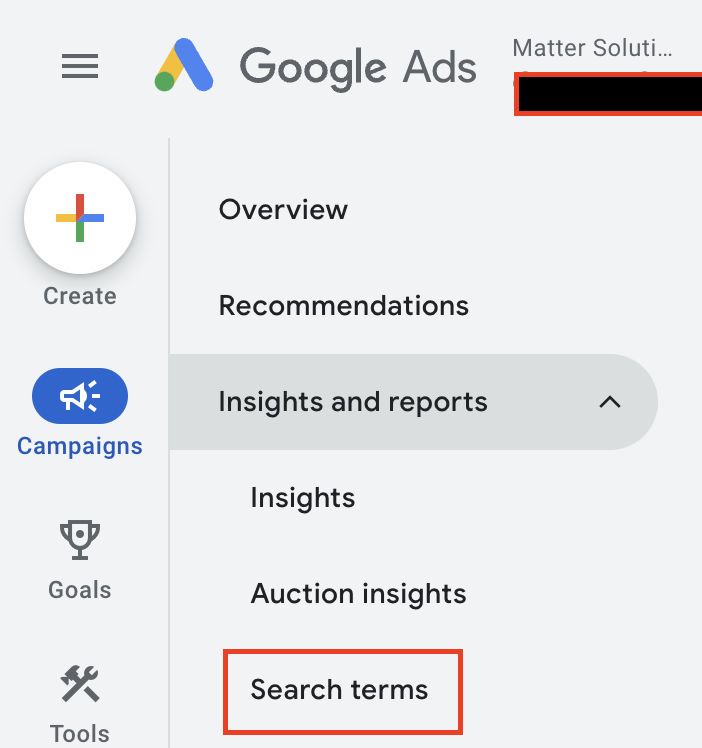
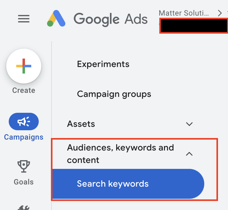

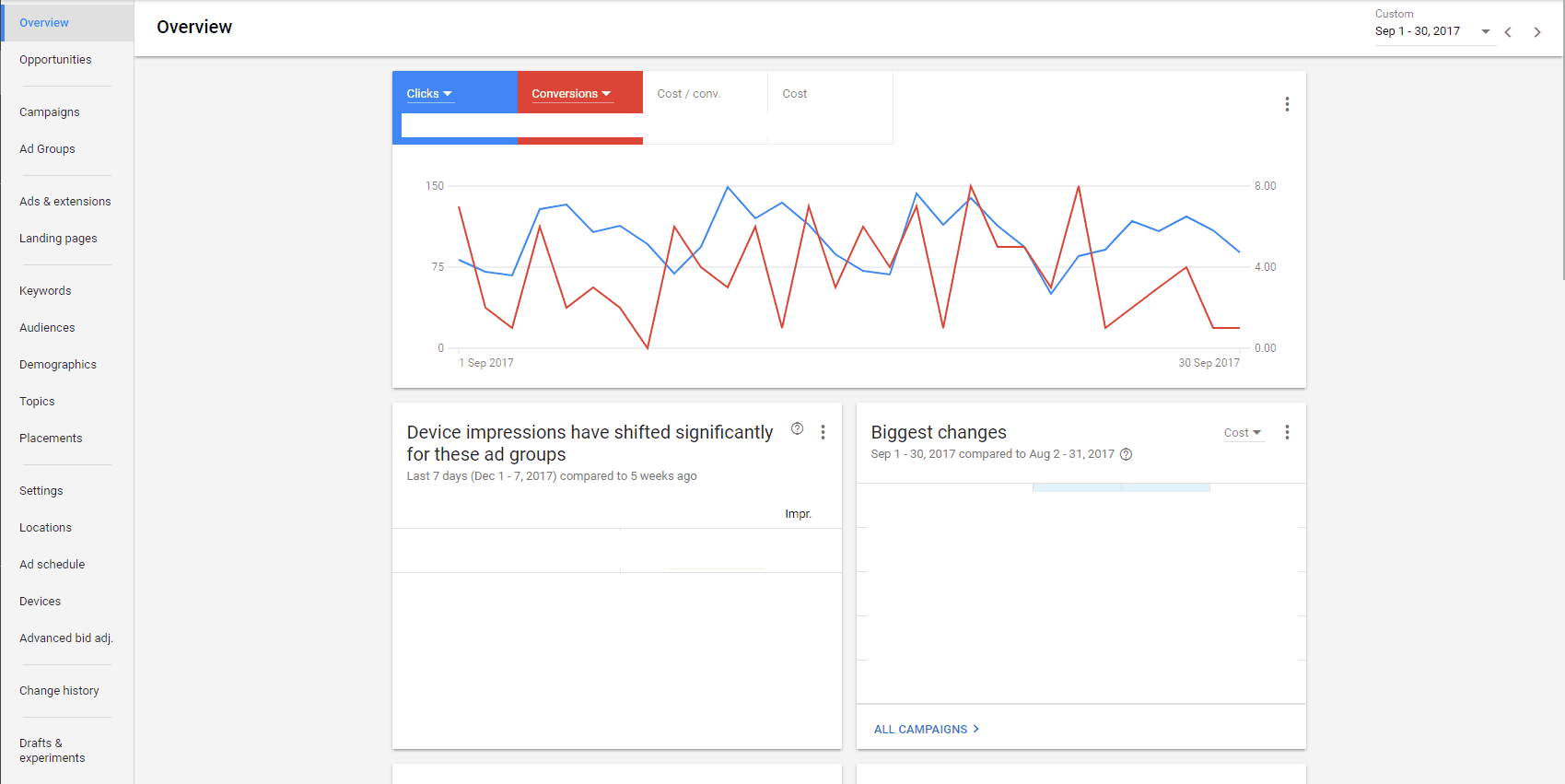


I too am having difficulty after over a decade with the older style interface. Like many, I find having to learn a new interface an annoyance when the old one worked just fine. But more importantly, the new interface is crammed and harder to read. Why can't I get rid of the left side column to free up more space? Why are there so many symbols for things that used to be expressed with words? And was it truly necessary to make every symbol's "mouse hover explanation" like a CSS dropdown on Quaaludes? Who has that kind of time or patience, Google?
This unwanted change represents one of the main problems with Google. They don't know when to leave well enough alone and have no concept of moderation. "Is our Google Doodle novel and interesting? Then surely adding one seemingly every other day won't diminish that novelty and become an annoyance, right?". Wrong, Google...wrong.
And the worst part is that this unnecessary change is probably in response to Facebook, though Facebook isn't Google's real problem. Most advertisers who are spending more than a few bucks are advertising on both venues (and Bing Ads). Google's real problem is a loss of shopper market share to Amazon and no amount of re-tooling their ad platform is going to bring those customers (who now start their product searches on Amazon) back.
Another big problem with Google in relation to Adwords is that they keep shooting themselves in the foot with changes detrimental to both advertisers and Google itself. A great example of this was the search results page ad format change of February, 2016 (where they removed the ads from the right side of the page). Did no one at Google realize that making this change would price out some advertisers? Do they not realize that bottom-of-the-page ads are virtually worthless for most advertisers and shouldn't even count as an impression? I have clients who stopped spending tens of thousands monthly because the CPC for their most competitive terms went to the moon after this change and they didn't want to lose money for months while battling for position. And those advertisers who did stick around? The storm has settled and most are paying only a slightly higher CPC because total competition dropped. Thus, Google isn't profiting more from higher competition but instead profiting less from having far less active advertisers in some highly competitive verticals.
But what unnerves me the most about Google are the myriad of ways in which they do a disservice to advertisers while trying to raise revenue. Their "reps" are a perfect example. As #Googlegate well proved, they are paid to get advertisers to turn on features whether it's to their benefit or detriment. "I really need you to add this extension and change your tracking attribution so I can get paid!" You can talk to 20 reps about 20 different accounts and they all have the same song and dance. Coincidence? I think not.
And while I'm at it, how ballsy does a company have to be to manufacture fake conversions in an effort to increase mobile spending, because that's exactly what the more recently added tracking attribution models do. A conversion is one single conversion. If you want to apply 40% of the credit for that conversion to mobile and 60% to desktop, or as another example, 28% to click 1 and 72% to click 2, that's fine. In both scenarios, the total attribution ads up to the whole number of 1. But that's not what these attribution models do. They assign (as an example) 70% of the credit for a conversion to mobile and another 83% to desktop for a total of 153% or 1.53 conversions.
Did you client get 1.53 x the value of the conversion? Of course not, so why is Google doing this? Because that extra ".53" across multiple conversions over time adds up to a high number of extra conversion actions that never actually happened. Google is hoping novice advertisers (retailers who don't manage their accounts by ROAS or lead generators who don't manage their accounts by CPA) will look at the resulting higher conversion numbers and say, "Gosh, look how many conversions mobile produced" and up their spend as a result. It's a con on Google's part.
So yes, you're not alone in thinking the new interface isn't an improvement. But with Google, that shouldn't be a surprise. They've been heading in the wrong direction for years.
It benefits agencies that are not an open book because if the client owns the account they get to see all these "recommendations", IN THEIR FACE, when they log in. Which at first glance appears like everything is wrong. There's warnings everywhere about you're losing x amount of traffic here, you could bid better, increase your bids, even when you've had a great day. To me it seems to tap the psychology of fear of loss. It shouts, increase your bids, increase your bids, increase your bids. And even if that doesn't make the client increase their bids, one can be sure that a rabid Google rep will be calling up relentlessly. The reality is, the data changes naturally and we don't want to keep increasing our bids. There's always new advertisers coming into the platform, seasonality impacts clicks, and people write new ads. If you're closely working with clients (that have large business and are worried about this) you can take time to explain what it all means, but it all takes a LOT of extra time. There's enough distrust in this industry already without magnifying fear of loss in accounts that are owned by the managers who are the most open with customers.
Another option, just lock the client out, own the account yourself. Problem solved. Most large agencies that offer a one size fits all, set it and leave it approach, just lock the client out. Then they lock them in with a long legal contract. Perhaps these business owners have had input in developing the new interface.
It's also ironic that Google talk about usability, but then when they created this interface they have done the complete opposite. That just confirms that talking about something is easier said that done. And that Google can talk the talk, but they can't walk the walk.
Love the imperial to metric comparison - it's the same thing and you should be able to do the same job, but it certainly takes the fluency and efficiency out of you for a while.
We'll get used to it and adapt to it like anything else, I guess.
My biggest gripe with it to be honest is that you can't pack as much data into the screen like you could before.
With a nice screen, you can look at all of your columns for your Campaigns/AdGroups/Keywords without having to scroll left/right and you could see a lot of rows without having to scroll up/down. It made data analysis lightning quick.
The only saving grace is that if we find it difficult to use, it must be confusion central for DIY'ers, meaning that our jobs are more needed than every to create and maintain a successful campaign.